Q&A with David Marine, Chief Marketing Officer, Coldwell Banker Real Estate
Rebrands are not for the faint of heart. Simply take a stroll down memory lane to remember the painful brand flubs of Gap, Netflix and the 2012 London Olympics. The more iconic the brand, the more resistant its audience to the change, causing many companies to back-peddle or avoid rebranding altogether.
As one of the longest-standing brands in real estate, Coldwell Banker Real Estate sought to avoid these pitfalls with its turn-of-the-decade brand refresh. As a 114-year-old-company with a massive network of 94,000 agents and brokers, Coldwell Banker knew that it would be challenging to unveil a new logo, look and feel. We sat down with Chief Marketing Officer David Marine about why the brand took a leap of faith and unleashed a “transparent rebrand” for the first time in real estate history.
Why the rebrand, and why now?
The visual identity and the logo were holding us back from the perceptions we wanted to create of Coldwell Banker in the marketplace. Coldwell Banker has the most sophisticated technology, and we are doing more for the smart home than any other brand in the industry, but our brand expression was tired and old. It was time to create a bold new look and feel that maintained our leadership presence while also cementing our innovation story.
What exactly is a “transparent rebrand?”
Coldwell Banker agents are passionate about our brand, so it was important that they were involved in the process. With a transparent rebrand, we would get the chance to engage our network and invite our people along on that journey, telling the story and showcasing the feedback and reactions from consumers.
We selected four offices as “beta testers” to assess the initial versions of rebranded yard signs, marketing materials and identity standards, and we invited their feedback to influence the final rebranded assets. There’s a big difference between looking at a logo on a computer screen and seeing it in real-life scenarios. This allowed us to capture perceptions outside the digital setting, run the beta testing, finesse the details, and prepare our people and our network for the change. It also enabled us to go about the process in a smarter way, rather than rolling out a new brand all at once and ultimately adjusting it after the fact.
How did you roll out the new logo?
Coldwell Banker has been around for 114 years, and the brand has remained largely untouched for the last 40. So we knew that the idea of change would be a difficult pill for some to swallow.
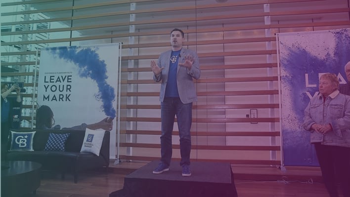
Every year, we host an annual event called Gen Blue with 4,500 agents and brokers who are the most invested in the brand. That’s where we initially announced the rebrand and unveiled the new logo. The response in the room was overwhelmingly positive. However, those who weren’t in the room to experience the reveal had the natural kneejerk reaction to change when they learned of it through secondary sources. While this was somewhat expected, I didn’t foresee how strong that reaction would be. We soon found that the negative responses came from a vocal minority in some select offices. We set out to visit those offices, share our story, and have a discussion about the intent and the motivations behind the rebrand.
I delivered a presentation called “Why Rebrand” over 40 times in the last year, laying out the reasons behind the rebrand. Once they understood the reasoning and the motivations, it was amazing how quickly people were able to get on board. People began requesting the brand to come out ahead of schedule.
![]()
What stands out to you as the greatest indicators of success?
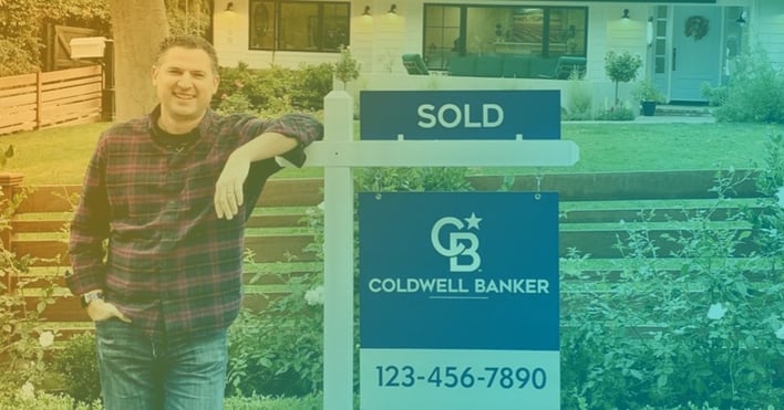
I saw a lot of indicators of success in our beta markets. We selected four different markets to test the rollout in yard signs and other collateral. The markets were chosen to represent a diversity of the areas we serve – luxury, mainstream, urban, suburban – all in various regions.
In the Washington, D.C. market, we sent four or five different styles of yard signs, and the agents immediately brought them outside to get input from people passing by. When we began to change the office signage, that’s when the tide began to change. People saw the new look as fresh, distinctive, sophisticated – but still unmistakably Coldwell Banker. An agent recruited in the Madison test market told us that a friend encouraged her to go to Coldwell Banker: “You’ve got to go to this company with the fresh new signs that everyone is talking about!”
What elements of the process surprised you?
The overwhelming clamor for swag! We released a highly produced launch video, featuring upbeat music and agents in newly branded attire. It drove a steady stream of requests from our agents for the hats, shirts, scarves, socks – all the swag they saw in the video.
Luckily, the logo was specifically created with that in mind. We designed it to be fashionable; something that people would want to show off. We started releasing the swag items on a rolling basis to manage the pent-up demand and drive excitement for the rebrand. Not only does that show us that people have a desire to wear the logo and showcase it out in public, but it also makes for an excellent conversation piece.

Tell us about the role that media relations played in the process.
For the first time, we invited journalists to join us at Gen Blue for a behind-the-scenes look. This helped us achieve two things. First, we were able to extend the media coverage of the rebrand from a moment in time to a much longer journey. Second, we were able to gauge their response to the new brand and use this to inform our efforts throughout the rebrand process.
Working with the G&S team, we held interviews with the trade media before our Leadership Summit conference, giving us the opportunity to tell the real story behind the rebrand, offer them insights from our test markets, and share what we learned along the way.
Get more client success stories delivered to your inbox when you subscribe to our newsletter.
Any final thoughts?
I told my team: We’ve only got one shot to rebrand.
We haven’t done this in 40 years, and we won’t have
the chance to do it again, so we need to do it right.
The team rose to the challenge.
We didn’t want to have one of those rebrands that was released and then quickly pulled back. During the process, there was a sentiment that we might retract due to the initial resistance. I have to credit the team with pushing through. We committed to the rebrand, and telling our story.
At the September Leadership Summit, then-president and CEO Charlie Young said to me that he had never seen a rebrand in the industry go the way this had. Everything was planned, executed and delivered at an exceptional level. We took advantage of that one shot.